![WORK LIST[DETAILS]](/contents/works/design/images/left_title.gif)


The Making of Asience 3: Shuichi Hirata (Art Director)
Asience: Hairy Tale is one of those little jewels Production I.G is particularly proud of. In just 60 seconds, this animated short concentrates the creative effort for one full TV episode, crafted by theatrical feature-class staff, starting from director Kazuto Nakazawa (Kill Bill: Vol. 1 animation segment) and continuing with art director Shuichi Hirata (Innocence) and music composer Yoshihiro Ike (Blood: the Last Vampire). In this multi-part special feature, we interviewed the production staff from every section, in order to offer a broader perspective about how this animation was made. In this third part, we interviewed art director Shuichi Hirata, the texture wizard who struggled with the recreation of Japanese traditional art using digital technologies and thorough researches on Klimt and in DIY stores.
 | Shuichi Hirata - Born on December 25, 1961. Art director. Hirata is credited as background artist in Grave of the Fireflies and in Mamoru Oshii's Patlabor 2: The Movie 2 (1993) and Ghost in the Shell (1995). He served as art director on Rintaro's Metropolis (2001), based on Osamu Tezuka's classic. His texture wizardry is probably best expressed in Cannes-nominated Innocence (2004, directed by Mamoru Oshii), and Annecy-selected xxxHOLiC - A Midsummer Night's Dream (2005, directed by Tsutomu Mizushima and based on CLAMP's manga). His credits with I.G also include the backgrounds for Milène Farmer's music clip Peut-être toi (2006). His favorite painter is Kandinsky, but he claims, "my interest never came in handy in my background art work!" |
So this time, you have taken the position of art director for Asience...
Oh, no. Actually, I've only done twenty sheets of background art by myself, so I don't know if I should call myself the art director. (lol) Director Nakazawa did the entire layout and I only put the art onto it. So it was basically a process of recreating the picture that the director had in his head. In a sense, this is easier.
Leaving aside how you call your position, the result is quite extraordinary to say the least. Could you please point out the important artistic elements of Asience?
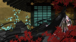
I basically had instructions from the director about three things. First of all, make it feel like a painting on Japanese paper. In other words, to recreate the two-dimensional plane of Japanese painting. Secondly, he wanted to utilize the lines in order to make the entire work give an impression of a Japanese painting. And lastly, to bring out the texture of a gold leaf gilded surface. I mulled over how I could recreate all this.
Actually, I am better at drawing on a piece of paper, so initially I intended to seriously hand paint it in detail. But even if I did draw a real Japanese brush painting, the texture wouldn't survive the scanning, so I decided to work hard on recreating the ambience of Japanese brush painting digitally.
What is the ambience of the Japanese brush paintings? Can you give some examples?
Nakazawa-san wanted me to recreate the ambience in Ito Jakuchu's paintings (*). So I used compositing and layering so as to create the 3-dimensional look to the plane surface.
Sounds challenging. Did you have to go through a trial and error process to get the right effects?
The challenge was to find the right look within the time I was given. I had to create a Japanese painting style without actually drawing a Japanese painting, so the very first step was to decide the goal for my work. When I work with realistic background art, I can easily estimate, but for this project, I had the hardest time trying to figure out what they wanted me to do.
Other than Jakuchu's paintings, did you investigate anything to find that goal?
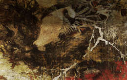
It might sound funny when I say, "observation," but I actually went to observe paintings gilded with gold leaf to see how I could make a glittering look. I found out that Klimt's paintings were the closest to what I was looking for. But even with Klimt's paintings, you need to light the surface to make it glitter. So I actually went to a hardware store. Finally, I found something you can print on a piece of metal at a DIY store. I thought, "That's it!"
To get inspiration for your work, it's best to go out and around. I love sewer manholes, bricks, rotten metal and dilapidated buildings. I just love the texture of the bricks of Tokyo Station. (lol) I do take photos, but it's better for me to remember what I see. They get nicely warped in my head with time. I use photos to draw specific things accurately. If you are just collecting impressions of things, then you get better results by relying on your memory.
What was the actual production process like?
Firstly, we needed to do the line drawings, so we used a technique commonly referred to as "harmony" and which has been used for a long time in the animation industry. The first step was to apply a gradation of slightly matt colors beneath the frame border and then boldly place lines on top. That was easy to do digitally.
Next, in order to create the Japanese paper texture, I hand drew a couple of texture patterns that looked like Japanese paper. I scanned them and uploaded it to my computer; I layered them and used watermarks to get the rough texture. If you mix that with the texture of concrete, you get a sufficient result. Actually, this process is the same as the traditional Japanese torn paper collage art. The difference is you are working with Photoshop, so everything is done virtually. (lol) Anyway, the process up to this point was just as usual. But then...
...then?
Well, how can I get the texture of gold leaf? That was my biggest challenge. You can't just paste the texture of gold leaf, so I decided to do 3-D processing. I used the camera mapping method to get a texture of a 3-D painting pasted onto an uneven metal plate. Then I tried to illuminate it in 3-D space to make it glitter.
I thought it went well, but when I showed the character to Nakazawa-san, he said, "a bit too glitzy, isn't it." He decided to go with a somber tone with less gilded look. At the end of the day, we didn't use that 3-D processing. And it sure made it look less intense. I regretted it personally. (lol) But when I saw the fished film, I thought the director made the right decision to go with the somber tone.
Any tips to the coloring?
The director said he wanted the color red for the maple leaves and the bloodshed only, and for the rest, I was asked to use colors that would blend in well with red. But personally I felt if I only used red for the maple leaves and the bloodshed, it would somehow make them less notable, so I used very dim red spots here and there. I thought, "if the director didn't notice it, then that's all right!" (lol)
I also consciously used Japanese colors, such as yellow-green, because we were pursuing the Japanese painting look, although, as a matter of fact, Jakuchu did stray from traditional colors. I owe a lot to director of photography Kanta Kamei, who did the rest of the work.
Which one is a memorable background for you?
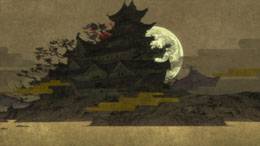
The first sequence at the beginning. With the moon rising behind a castle. It turned out to be the closest to where I intended to put the light source for the scene.
What was your impression after watching the entire film?
I imagined it would be much brighter, so when I saw it, I thought it was kind of subdued. But later, I felt it was kind of cool. I don't know whether I could use the word ma in Japanese, referring to the subtle rhythm created by movement and stillness, but the way ma was used was cool. There are no hard action scenes, but the overall flow proceeded quite rapidly and I enjoyed it. And I loved the almost dreamy use of colors in the final sequences.
(*) Ito Jakuchu, Japanese painter, 1716 - 1800.
(3 - to be continued)
© 1994-2007 KAO CORPORATION. All Rights Reserved.

 terms of use