![WORK LIST[DETAILS]](/contents/works/design/images/left_title.gif)


The Making of Asience 2: Idumi Hirose (Color Designer)
Asience: Hairy Tale is one of those little jewels Production I.G is particularly proud of. In just 60 seconds, this animated short concentrates the creative effort for one full TV episode, crafted by theatrical feature-class staff, starting from director Kazuto Nakazawa (Kill Bill: Vol. 1 animation segment) and continuing with art director Shuichi Hirata (Innocence) and music composer Yoshihiro Ike (Blood: the Last Vampire). In this multi-part special feature, we interviewed the production staff from every section, in order to offer a wider perspective about how this animation was made. For this second part, we interviewed color designer Idumi Hirose, the girl who dosed whites and blurred cheeks.
 | Idumi Hirose - Born in 1977. Color designer. She decided to join the world of animation inspired by Laputa: Castle in the Sky. Hirose initially joined I.G in the coloring section, and debuted as color coordinator in the TV series Vampirians: The Veggie Vampires (2001). She then worked in many I.G productions, such as Dead Leaves (color design), Innocence (color coordinator), Otogi Zoshi (color design assistant), Windy Tales (color design), Le Chevalier D'Eon (color design) and xxxHOLiC (color design). Hirose-san is widely reputed Production I.G's super idol (as she would promptly confirm herself if asked). Nickname: Hokki. |
Let's start with a basic question. What do color designers do?
We mainly decide overall color tones for the characters. We have to take the background - the art director's arena - into account and see how characters and the background turn out on the screen. And considering the concept of the project, we try to create characters that are closer to the director's vision. Most of the color designers ask to become such from the coloring section, as in my case. But in the beginning, I didn't know anything. I remember asking, "What's copy-pe (copy and paste)?" (lol)
When you started working on this project, was there anything you paid special attention as a color designer?
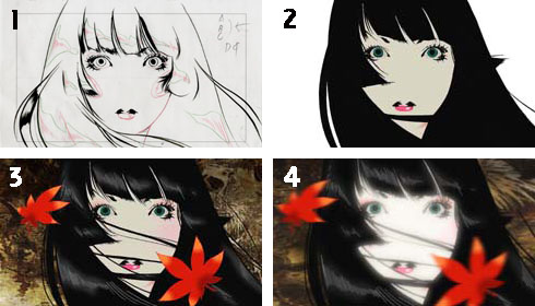
The work itself was not that different from what I'd been doing, but when I saw the storyboards by Nakazawa-san, I knew it was going to be totally in a style of the picture scrolls. So I started out with figuring out how those pictures where going to move, and consequently, which software I should use and what sort of treatment was required to create these looks.
You mean to say that each software has different outcomes?
Sure. What we did here to recreate the brush-touch in the in-betweens was to trace the outline of the brush strokes and then fill-in with color. So first of all, we created samples with two software suites, Retas!Pro and Animo, and showed them to the director. Animo was used as a paint tool for Innocence. It allows us to do grey scale scans, so that the touch of each line, whether they are hazy or wide and clear, shows up beautifully. But the lines created by clear dots looked more like brush lines, so the director chose Retas!Pro.
Was there any material you used for reference?
I looked at reference materials on old picture scrolls. I discussed a number of times with the director about the whiteness of the princess's skin color. I heard that they were going to do a filming process that would slightly whiten the colored surface, so I experimented with a sample. I decided to use less white and add a little yellow to make it look as if it were drawn on old paper.
Is there any sequence that you like?
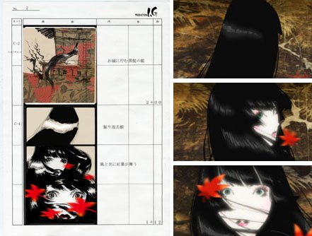
I quite like the final sequence, where the background becomes white, but I'd definitely choose Cut 4. It's the sequence the director drew first to show us the image of the entire work. The finished sequence is actually made up of several layers, so it is a little complex structure. For example, you might not notice at a glance, but the highlighted hair has two different colors. First, I highlighted the black hair with slightly lighter black and blurred it. Then topped that with light colored highlight lines. That created shines and made it look so attractive. It was like adding highlight lines on the halo of an angel.
I used a separate layer for the eyeshadow too. If you blurred the crescent shaped original material as is, you end up with a gap between the shadow and the eyebrow. So in order to avoid the gap, I've asked the painting section to make the shadow slightly bigger. I had done the same for the cheeks too. I made them in different layer and had them painted larger than the actual size and blurred them. That way, we could avoid the gaps. The moving hair was a separate layer too.


Maple leaves, the dark side of the Princess' neck and highlights on her lips all used this blurring effect. I blurred some detailed sections myself to give a reference for Kanta Kamei, the director of photography, but of course he did the bigger portions.
You do not usually apply these detailed processing.
You're right. Because we only had thirty cuts in this project, I was able to dedicate time to such details. In a standard TV production, we could afford it only in a very limited number of specific sequences.
A general question now. What kind of paintings do you like?
I like Chagall and Mucha. When I see a painting, I can grasp the entire coloring at once. When I see a building or a design, I am inevitably attracted by pretty colors.
What were the things you were most careful about in the production?
The materials we worked on were so complex that I tried to group them so that it would be easier for Kamei-san to work with. I had to check to see, for instance, if I had all the materials grouped intact and the masks could be cut appropriately. A typical TV series would not have a color designer adding the blurring effect, so there were a lot of trial and errors on the way.
What is your overall impression?
I was impressed by everyone's technique! I was so grateful to be able to work with such a gifted staff, starting of course from Nakazawa-san, and then our 'big sister' Nishimura-san, the in-between checker, Hirata-san, the art director and Kamei-san, the director of photography.
Are you hoping to utilize the experience in the future?
Certainly. The fact that you could add a little more touch to the finished material and get a completely different result, was indeed an important experience I gained. In future works, I think it would be interesting to work on perfecting the make-up on female characters if I have the chance.
(2 - to be continued)
© 1994-2007 KAO CORPORATION. All Rights Reserved.

 terms of use