![WORK LIST[DETAILS]](/contents/works/design/images/left_title.gif)


Interview with Ren Ishimori and Ryo Hirata (2)
| Ren Ishimori (left) Born in Tokyo in 1978. After graduating from the Tokyo University of the Arts, he became a freelance artist, specializing in three-dimensional modeling, and later joined Production I.G as clay modeler. For Oblivion Island, he contributed not only the island inhabitants' designs, but also vehicles, props and objects appearing on the island. Ryo Hirata (right) Born in Osaka Prefecture in 1977. While studying at the Kyoto Seika University he worked for the graphics development of videogames at Intelligent Systems, a company he joined after graduation. Freelancer since 2006, he's been working as character designer in several video games, such as Fire Emblem (2003), Fire Emblem: The Sacred Stones (2004), Famicom Wars DS (2005) and Theme Park DS (2007). For Production I.G he worked as character designer in the music clip for KinKi Kids member Tsuyoshi Domoto's solo single Kurikaesu Haru (2008) and Kazuchika Kise's directorial debut, Drawer Hobs (2011). |
PART 2
Which character was the hardest to make?
Ishimori: For me it was Teo. He was the first I started working on, but I had a very vague idea of how he was going to interact with the other characters on the island, and I could not find a good balance. But the greatest hurdle was probably the fact that he had to be kind of cute, and designing cute characters is not exactly my forte. I tend to design weird stuff, you know. When I came up with the first design of Teo, they told me, that's too creepy, do something about it! (lol)
Hirata: I remember that design. He was kind of taller and more adult-looking.
Ishimori: To me it looked cute enough in his own way, but apparently director Sato was looking for a different image. We, Sato-san and Shiotani-san went back and forth on Teo for a while, and I have to say that the final result was very well balanced with Haruka.
On the opposite, I could almost do whatever I wanted with the bad guys!
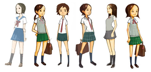
What about the human characters? I've heard that Hirata-san had a hard time finding the right Haruka, am I right?
Hirata: How do you know? (lol) For Haruka alone I made something like a hundred different design proposals. I drew all possible different variations, such as make her look one year older or younger than the age we established, 16. Haruka was a complex character with so many features and restrictions. She had to be cute at first glance, but also the kind of girl capable of action, and so on. So I made her with short hair and slightly tanned, to emphasize outdoor activity. By contrast, her friend Miho is more an indoor type of girl, so I made her paler. Haruka's school uniform is a mix of existing uniforms designs, and I was careful not to make it look unfashionable from real teenage girls' point of view. I had to study over an embarrassing amount of mags about high school girls, and by the time I had become an expert! (lol)
Any point you dedicated specific attention to?
Hirata: I wanted the audience to relate with this basically cheerful and positive girl, who has this small but persistent shadow lingering somewhere in her heart, and who does not get along with her father too well recently. On the opposite, initially Haruka's father looks somehow distant and uncaring. This is how he looks to her, and therefore he must look so to the viewers too. But as the story progresses, Haruka re-discover his true feelings. Therefore, I wanted the father's design to reflect these layered features.
Ishimori: Also the balance between Haruka and the islanders was very important. For example, since white was the basic tone in Haruka's uniform, we avoided using that colour for the islanders, with the Baron being the only exception, in order to emphasize Haruka's pureness.
What made you happier in getting involved with this project?
Hirata: My job started from drawing with pencil on paper, developed through clay modeling, to be eventually translated into information inside a hard disk. When I saw the complete movie, imagining all the process my piece of paper went through and the work contributed by so many other people, I felt a kind of fulfillment that could hardly be expressed with words.
Ishimori: I realized that Sato-san and Shiotani-san really liked what I did for them. But I want you to see all the intricate details we put into every character, every scene and in the background art, sometimes appearing on screen only for few seconds.
(2 - end)
© 2009 FUJI TELEVISION NETWORK / Production I.G / DENTSU / PONY CANYON

 terms of use